

Creating an award winning Intranet
A redesigned intranet for a global workforce, focused on creating a flexible, visually coherent platform that could scale across teams while improving engagement and adoption.
Overview
Webuild is a multinational construction and engineering group with over 35,000 employees across multiple countries and business units. Rapid growth had left internal communications fragmented, with low engagement and limited visibility across the organisation.
The brief wasn’t simply to rebuild an intranet that worked. The client wanted a platform that felt modern, credible, and desirable to use — something employees would actively return to. Visual quality and brand perception were seen as critical levers for increasing usage, alongside usability and structure.
From the outset, one of the project’s KPIs was external recognition. Awards were viewed — rightly or wrongly — as a way to signal quality internally, raise visibility, and drive adoption across the workforce. That expectation shaped both the design approach and the level of polish required across the platform.
The challenge
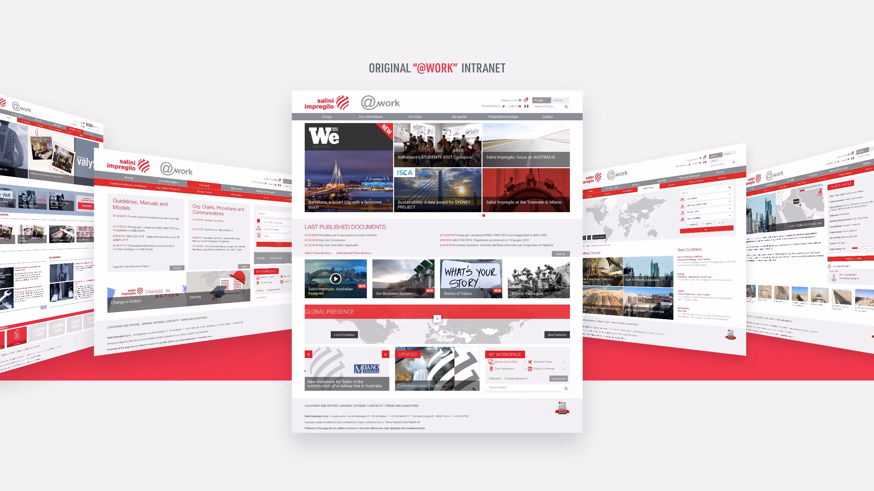
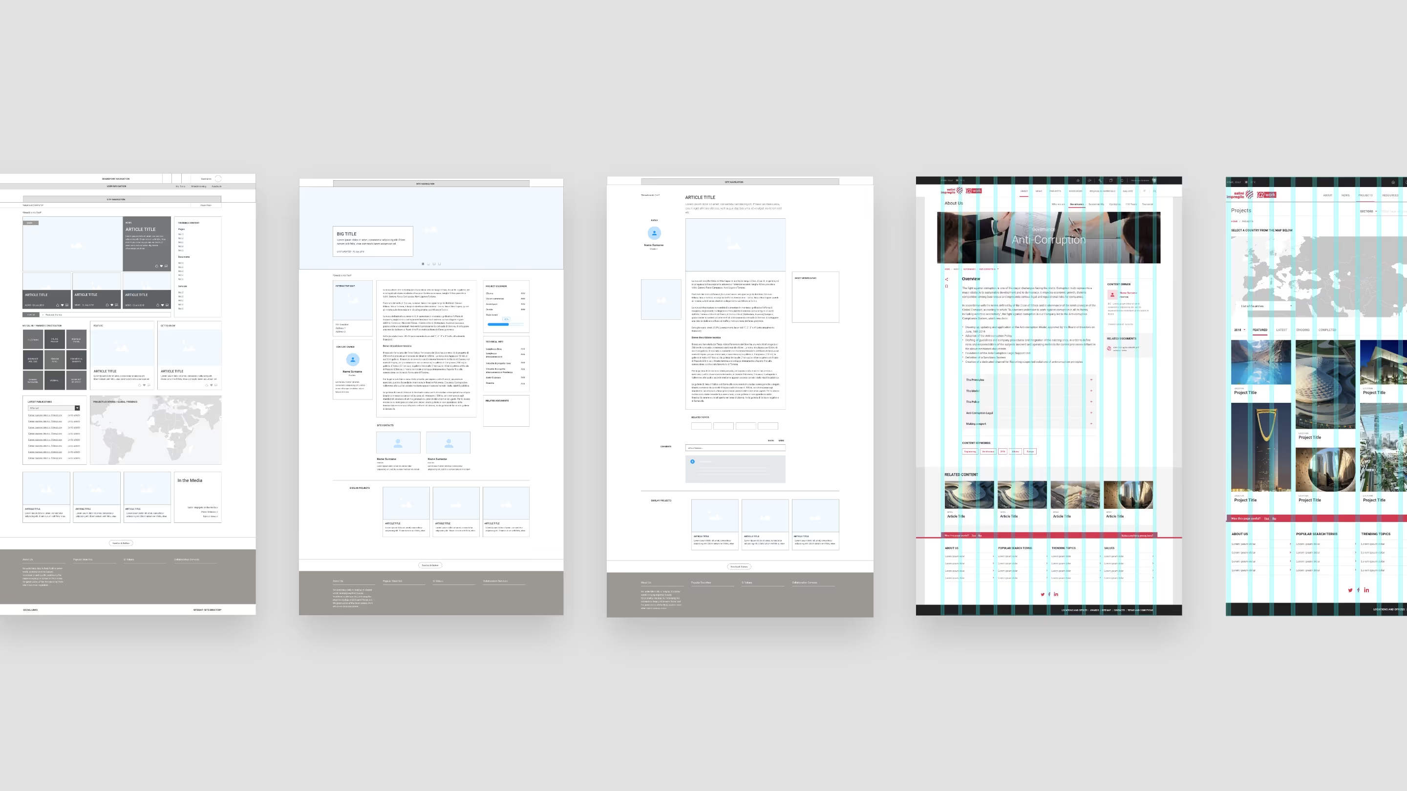
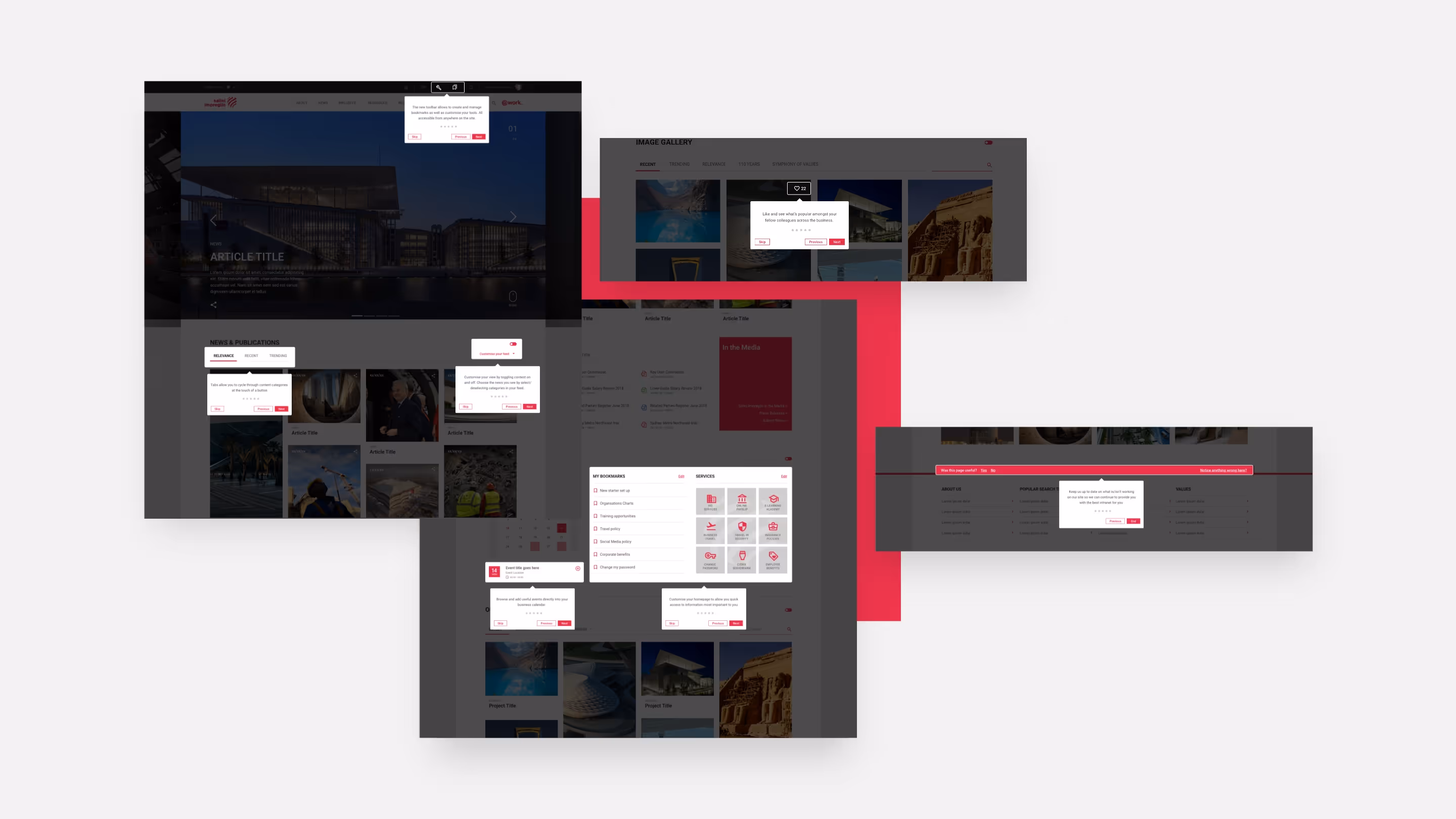
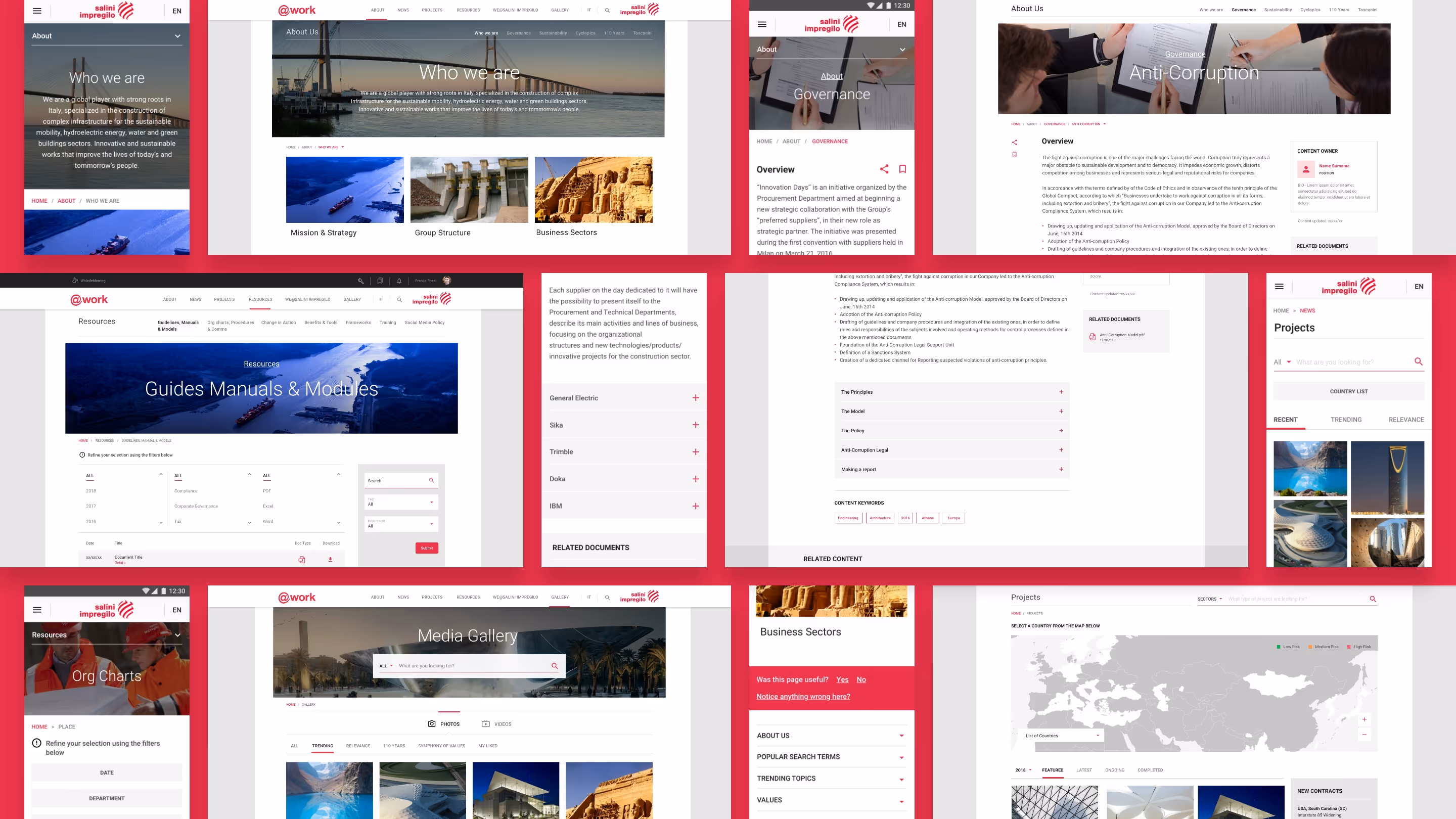
The existing intranet struggled to support the organisation’s scale and complexity. Content was inconsistent, navigation felt disjointed, and there was no clear visual structure to support the range of content teams needed to publish.
At the same time, the platform needed to allow customisation across business units without losing coherence at a global level — all within the constraints of SharePoint.
The core challenge was balancing consistency and flexibility: enough structure to keep the platform clear and navigable, but enough freedom for teams to prioritise content relevant to their audience without fragmenting the system.
My Role
I worked as part of a multi-agency delivery team, partnering closely with UX, content, and technical leads to ensure the visual system aligned with the wider platform strategy and delivery constraints. My responsibility was to define a flexible visual system that could accommodate the client’s priority content types, support customisation at scale, and remain consistent across regions and teams — working with SharePoint rather than fighting against it.
In parallel, I led a light evolution of the Webuild intranet brand, refining typography, colour, layout, and UI patterns to ensure the platform felt slick, contemporary, and credible. The goal wasn’t novelty, but confidence: a platform that looked as good as it functioned, and felt worth engaging with.
Design approach
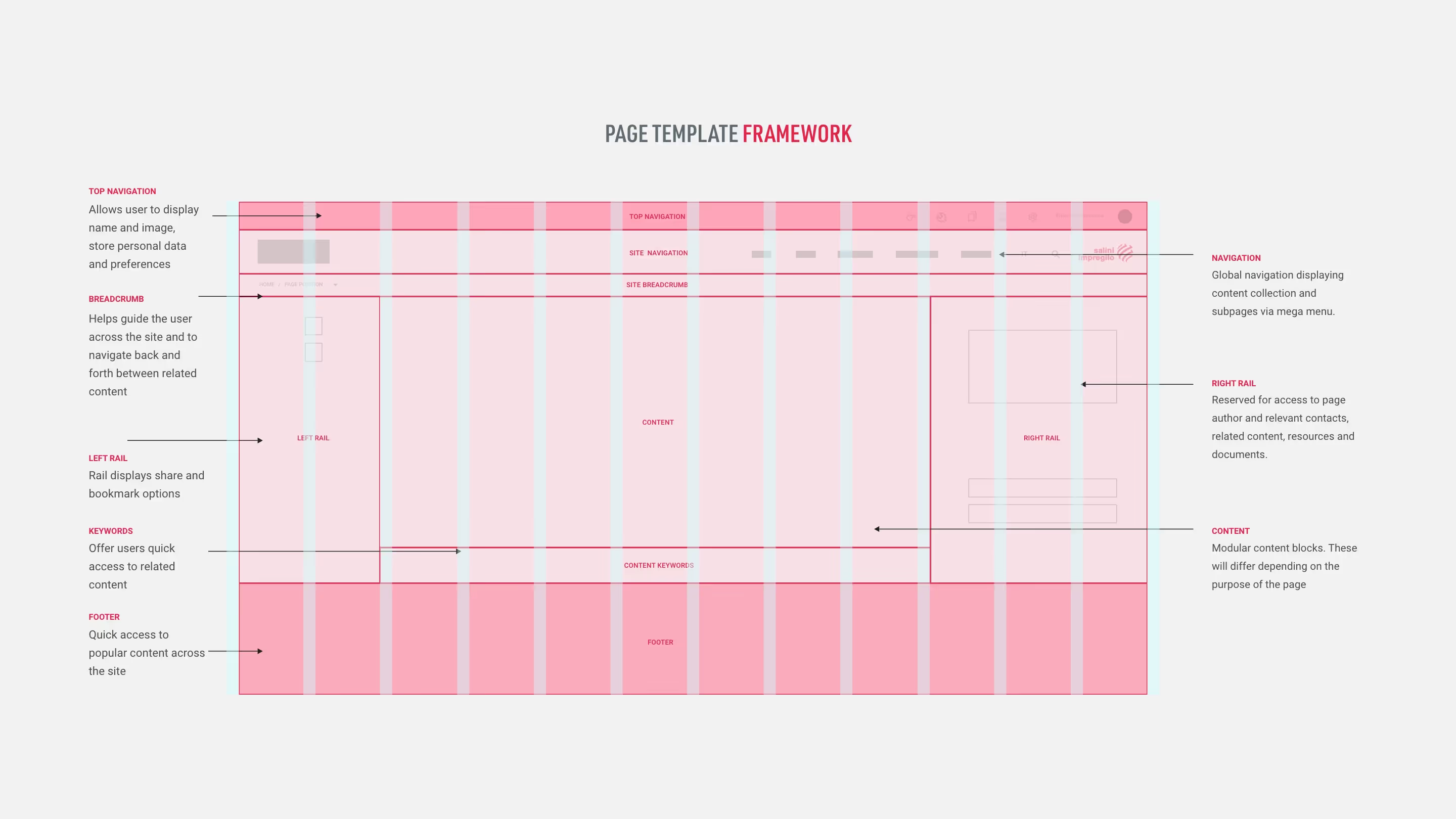
The core of the work was creating a visual framework that balanced flexibility with control.
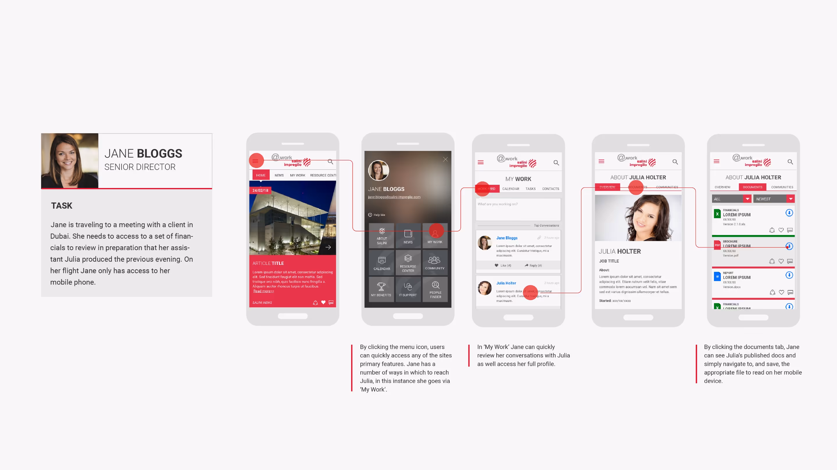
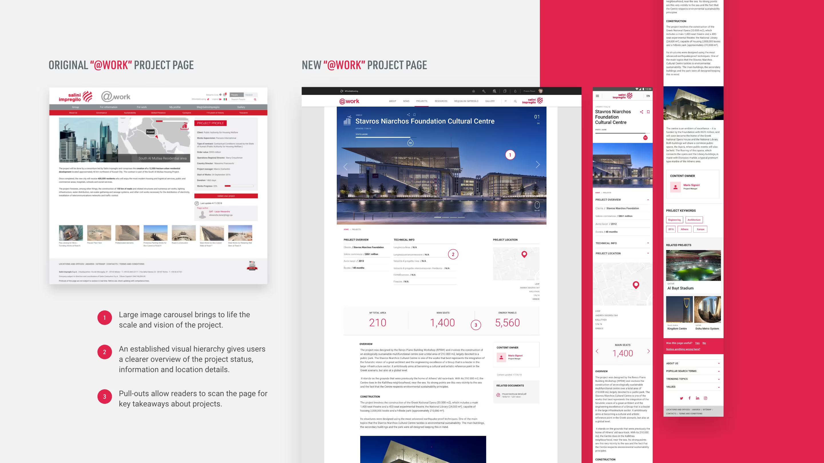
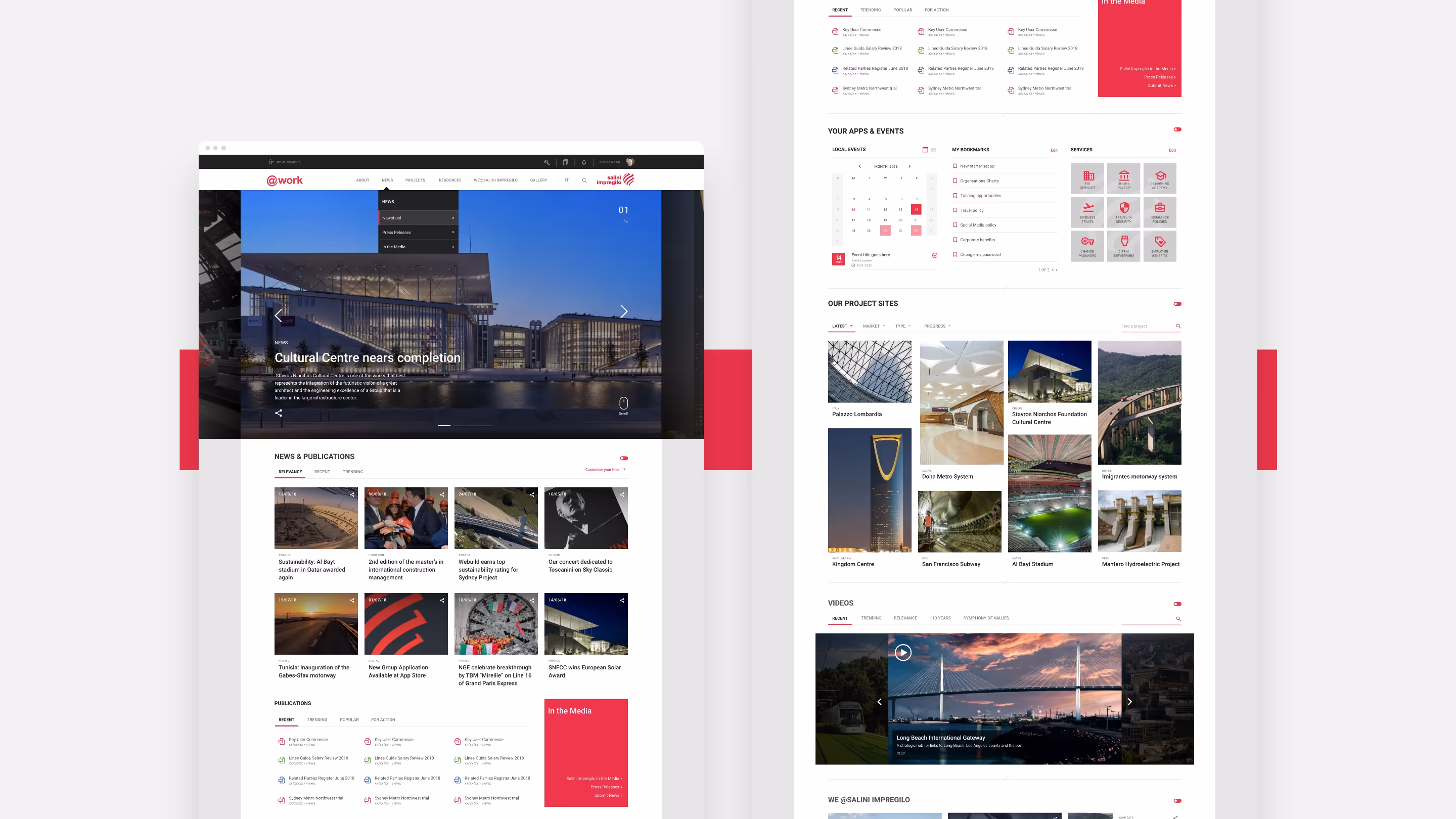
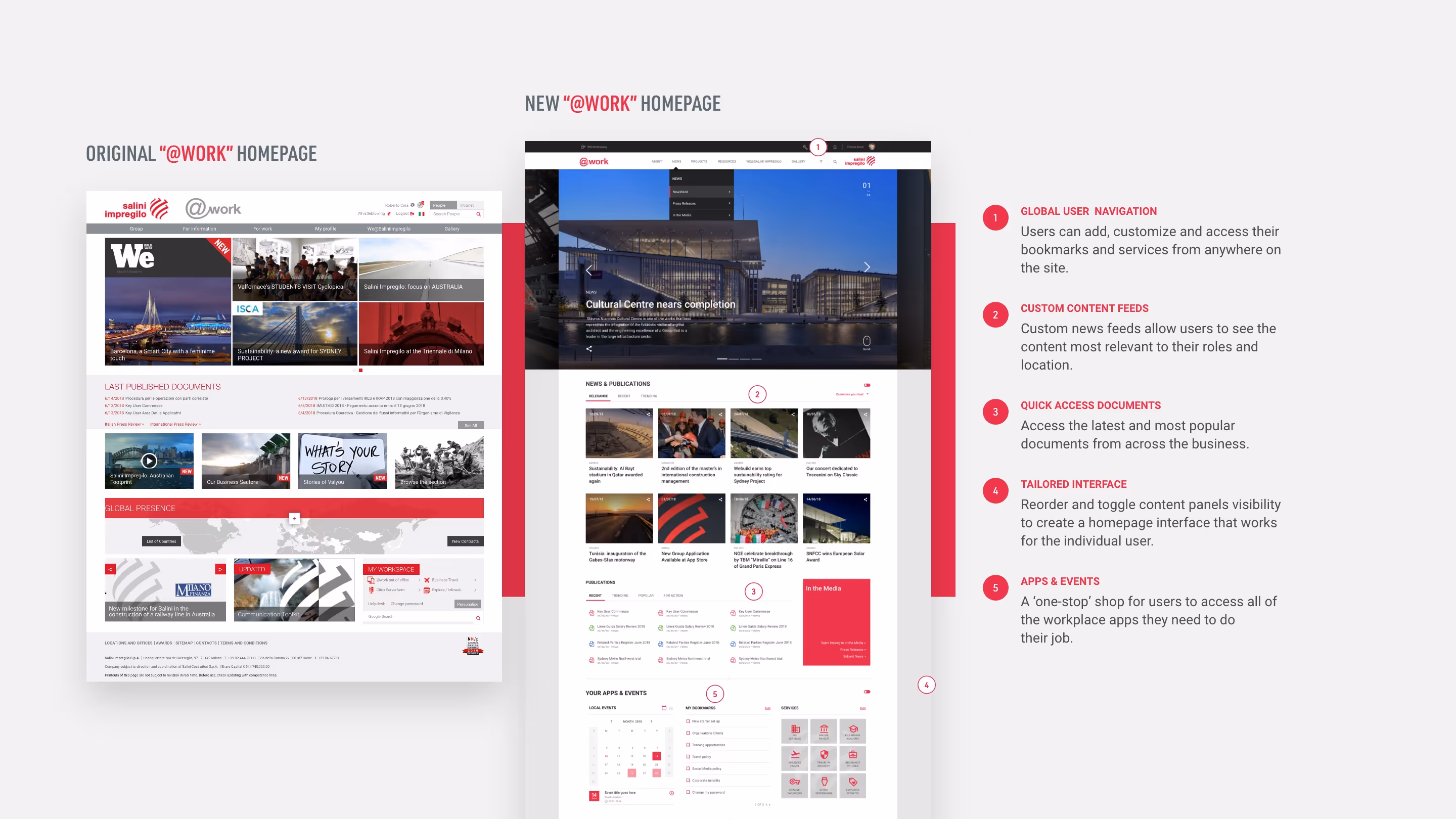
Rather than designing one-off pages, I focused on a set of modular templates and components that could be reused across the platform. These were designed to support different content priorities while maintaining a clear hierarchy and rhythm, regardless of how teams chose to populate them
Customisation was a key client requirement, so every design decision was tested against how easily it could be adapted without breaking consistency. The system needed to feel open and adaptable, but still recognisably part of a single platform
Visual hierarchy played a critical role here — ensuring that important content surfaced clearly, secondary information didn’t compete for attention, and pages remained scannable even as content density increased.
Designing within constraints
SharePoint imposed clear technical and structural limitations, particularly around layout flexibility and component behaviour.
Rather than treating these as blockers, the design work focused on identifying where consistency mattered most and where variation could be safely introduced. This allowed teams to express local identity and priorities without undermining the overall coherence of the platform.
The result was a system that felt considered rather than templated — structured enough to scale, but flexible enough to support real-world use.

Brand and visual refinement
Visual quality was not a secondary concern on this project — it was a deliberate strategy.
The client believed that a platform that looked good would be taken more seriously internally, helping to shift perception and encourage repeat use. That belief directly informed the level of attention given to typography, structure, colour, and motion.
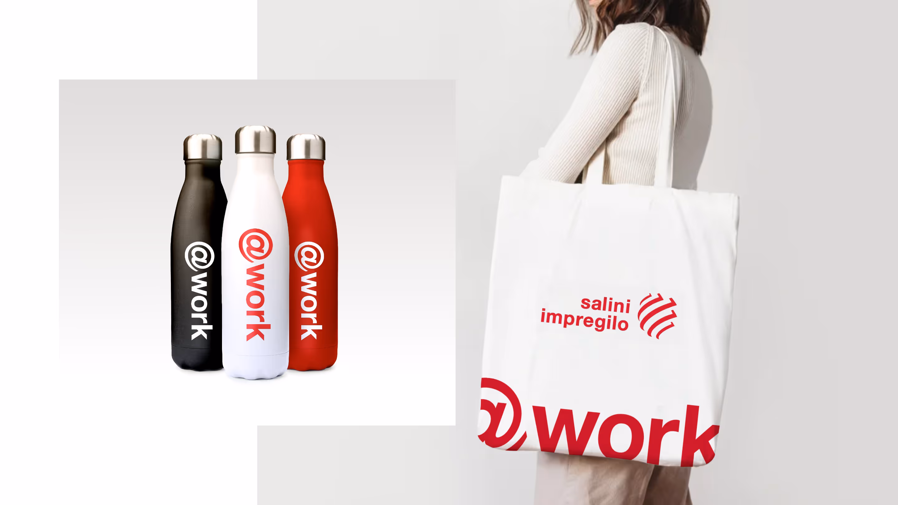
I led a refinement of the intranet brand, updating visual elements to feel more contemporary while staying aligned with the wider Webuild identity. This ensured the platform felt credible, professional, and award-ready, without introducing unnecessary brand divergence.
The aim was to create something that employees would be proud to use — not just something that functioned.
Outcomes
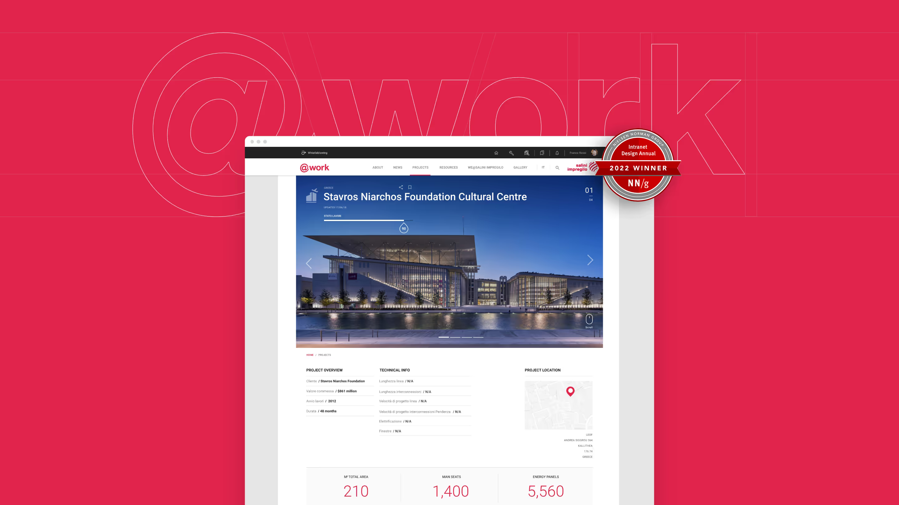
The intranet was recognised with multiple industry awards, including:
- Intranet Italia Champions – Best Intranet 2021
- Nielsen Norman Group – 10 Best Intranets of 2022
These awards were not incidental. External recognition was an explicit project KPI and a key part of the client’s strategy to increase internal visibility and adoption.
The final platform delivered a flexible, scalable visual system that supported a wide range of content types, enabled customisation across teams, and presented a cohesive, high-quality experience for a global workforce.
Reflection
This project demonstrates my approach to visual leadership on complex platforms: working within constraints, designing for scale, and using craft and brand quality to influence perception and behaviour.
While my role centred on visual design and brand evolution, the work required close cross-disciplinary collaboration and a system-led mindset — ensuring that what was designed could be used, adapted, and sustained long after launch.